Dashboards
Background
From Monday to Friday I create dashboards in Power BI for a company in Manchester (and really enjoy it). During the start of lockdown I decided to challenge myself and scratch up on my R skills and attempt to create a covid-19 dashboard using the flexdashboard package in R. I considered using Shiny but the integration with Github Pages seemed a little easier, and meant that all I had to do for deployment was click one button in R and commit the updated html file directly to github - no hosting issues. The tutorial showing how to host a flexdashboard on Github Pages was fairly vague but I got there in the end.
I first tried to draw on my dusty modelling skills from Uni and fit an SIR model to the covid-19 data, to try and predict the outbreak, based on this blog post - I failed miserably, but luckily stumbled on Rami Krispin’s dashboard made using flexdashboard in R. I also struggled with finding an accurate provider of the infamous JHU dataset, consuming it from source required me to update my code daily (as they had to make regular changes), and I failed to connect to several API’s (user error I assume) - in the end I found a nice coronavirus package in R which alot of people where using.
The Dashboard
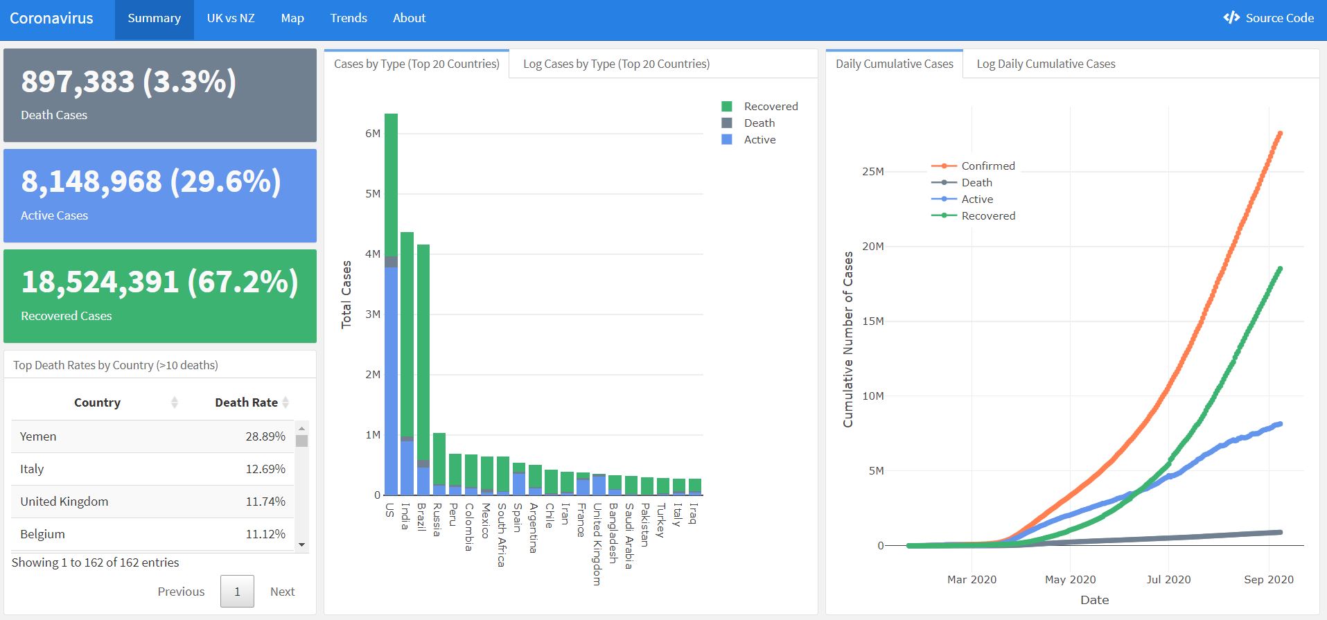
The dashboard shows cumulative cases, death rates, a comparison between UK and NZ (partly to show 2 very different government responses to the outbreak), an interactive map of cases and another tab of some general trends. Check it out below:

As the UK lockdown dragged on I quickly lost interest in developing it further (I had probably moved onto banana bread by that stage), but recently checked on it to see if it was still working (by some stroke of luck it was), so it includes data up to about mid September.
Power BI vs R?
Based on my experience creating this dashboard, I think Power BI is definitely my preferred choice to make a dashboard. The lack of “drag and drop” was painful for positioning graphs and tables, and having to render the dashboard after each change, rather than seeing it change live was tedious. However, it was awesome having direct access to the Tidyverse and I can imagine the machine learning and data viz packages would easily outperform Power BI’s capabilities. However, for something as simple as descriptive statistics with a few graphs I would much prefer to use Power BI. It’s not really even fair to compare both tools, since R is capable of many many things, and was never initially designed to be a dashboarding tool.
Of course, Power BI comes with a hefty cost for enterprise clients, starting at around $5k per month for Power BI Premium, or 10 dollars per month, per user for the Pro version. R is of course, open source and comes with 16,000 different free packages for almost any data scenario (this website is entirely created in R, for example).
An under-looked feature of Power BI it’s ability to run Python and R scripts in the Query Editor (where data manipulation happens) as well as for custom visuals. There are some limitations, such as a limit on the number of rows used for a visualisation, and if an automatic refresh schedule is needed, you will have to publish the final report via an on-premise gateway (with R installed), which comes with it’s own challenges - but hopefully these will be addressed in time. Here’s some cool showcases of how R and Power BI can be used together. It’s definitely something I want to take advantage of in the future.
As with all of these “which data tool is better” posts flooding the internet, the answer is that it will depend entirely on the use case. Problems requiring very complex data cleansing, state of the art statistical analysis or smaller companies unable to afford the cost of Power BI Premium would be better off going down the open source route (R/Python), whereas larger companies that need the security, scalability and support of a commercial tool would be better off using Power BI - not to mention some exciting features recently released/on the horizon!